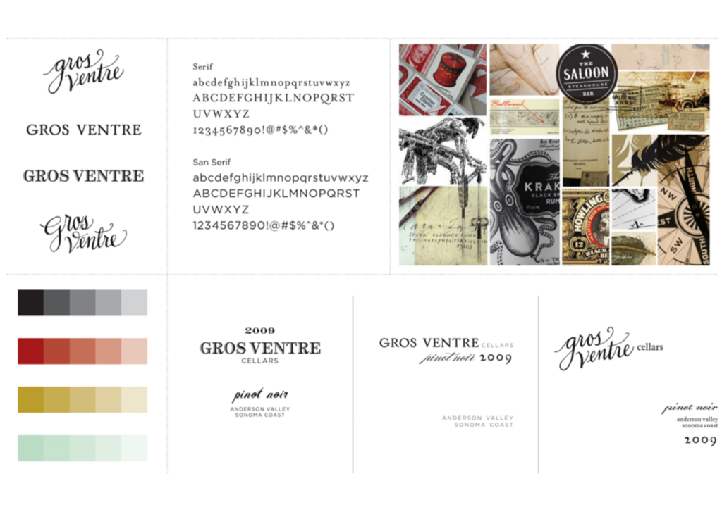
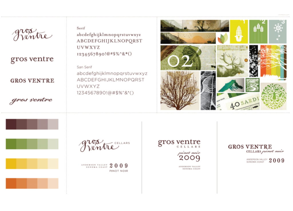
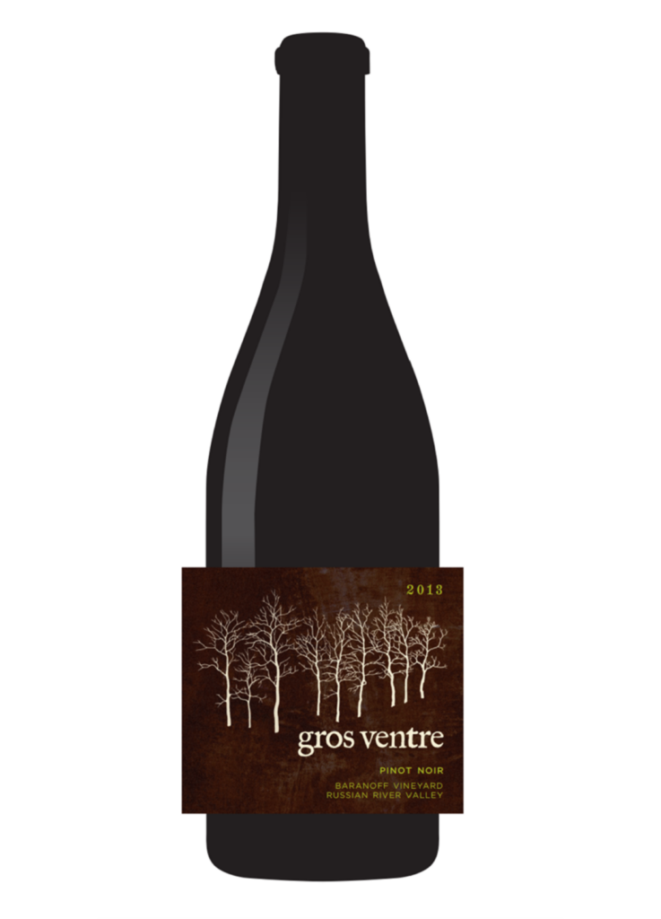
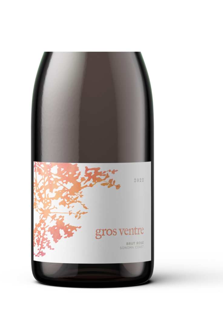
It’s been about 15 years since we started working on the label design and brand for Gros Ventre, with its latest iteration being the new Brut Rosé label concepted and designed by our friends Jen and Jon Campbell. They’ve been the creative minds behind our brand from the very beginning, and have become dear friends along the way. I’ve been wanting to write about them for some time, and with a new label fresh off the presses, it seems like the perfect time.
I’ve always enjoyed copy, art, and design. It’s what led me to my first job at an advertising agency in New York City – I couldn’t resist the headlines, design layouts, free flow of ideas, and creative people. An appreciation for graphic design grew over the years, and I noticed that some work just felt “right.” I couldn’t explain it or do it myself, but I did know who was capable of creating the good stuff.
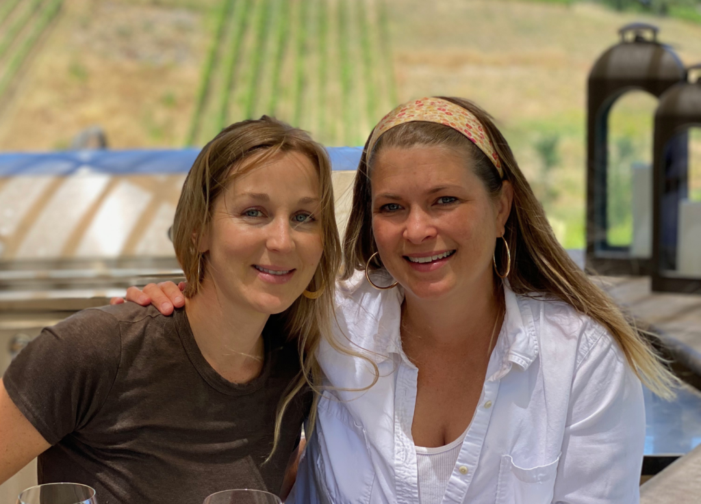
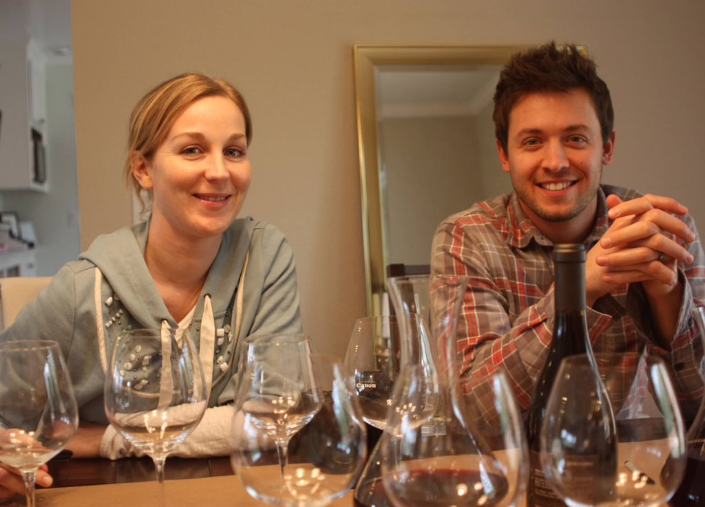
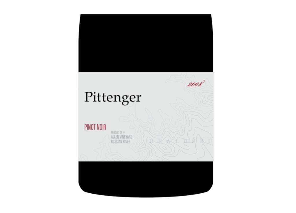
Jen and I met while we were working at an advertising agency in San Francisco. Even at a very young age, her calm, peaceful demeanor and beautiful designs soon had her creating some of the agency’s best work. So, when it was time to start designing our label (around 2008), she was our top choice. Lucky for us, she said yes – and even better, brought her fiancé at the time (Jon, also a designer) on as her partner.
We decided to have them over to taste the products. As it turned out, Jon and Chris share an appreciation for many things – surfing, wine, dry sarcasm and inappropriate jokes (which had Jen and me pretending not to laugh while doing a lot of eye rolling). After that evening, we decided the best course of action would be to conduct a deep exploration of wine out of our apartment. One evening turned into thirty evenings, and multiple brown bag blind tastings gave us a deep dive into new world Pinot Noirs, old world everything, and many, many other wines from around the globe. It was FUN. And those hours of wine education launched the design of our label and brand right – with a design team who knew exactly what we were about. It seriously enhanced my own wine education and understanding of Chris’ journey in wine over the years (from bottle shop to restaurant to winery), an unintended biproduct that, looking back, probably helped our partnership get started on the right foot. And it created a friendship with the Campbells that we enjoy to this day.
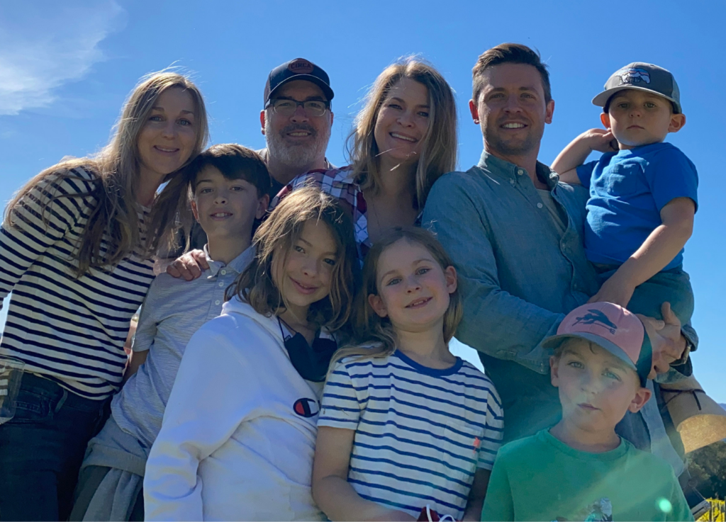
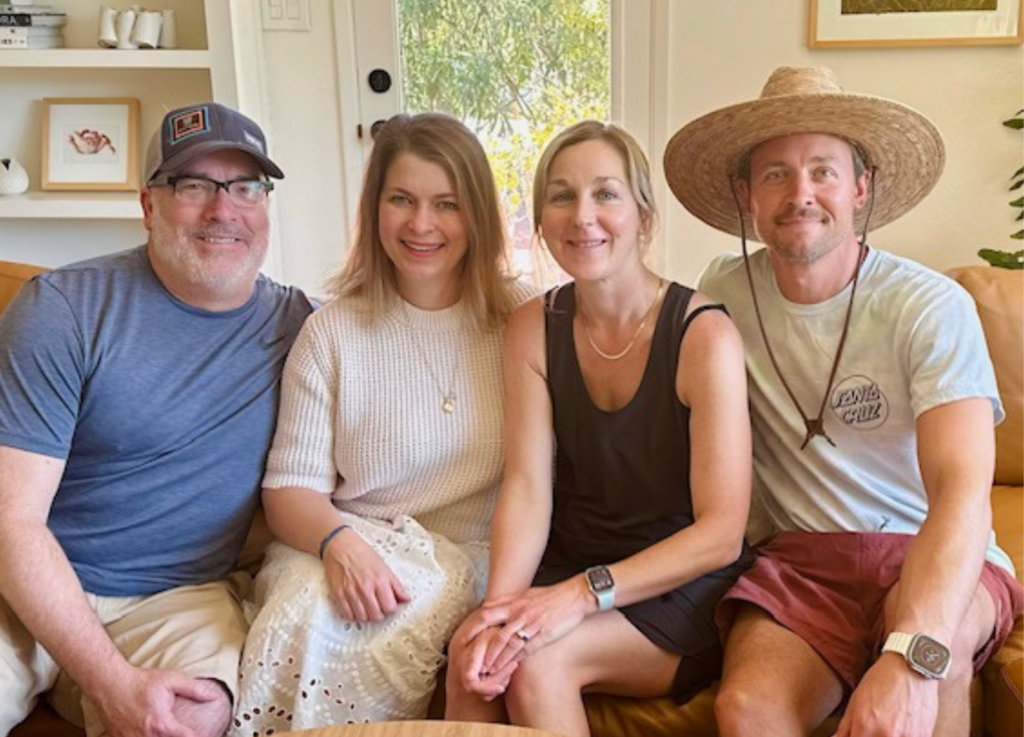
Over the last 15 years, we’ve all grown together – adding a collective 5 kids to the mix, moving a few times (with the Pittengers landing in Healdsburg and the Campbells in Santa Cruz) and evolving our businesses and careers. They put up with us all this time, and we hold their friendship very dear. So, we asked Jen and Jon to help us tell the story of our brand.